Web Design Archives - DIP Outsource Web Design Services

Web Design Trends in 2024 for a Stunning Online Presence

web Design trends in 2024

In the ever-evolving landscape of the digital world, web design trends play a pivotal role in shaping the online experience.  As we step into 2024, the realm of web design is witnessing a fascinating evolution, marked by innovative approaches and user-centric designs.  In this blog post, we’ll delve into the key web design trends that are dominating the scene this year, with a particular emphasis on the importance of responsive designs. Responsive Designs: A Cornerstone of Web Development in 2024 The significance of responsive web design cannot be overstated in 2024. With an increasing number of users accessing websites through a variety of devices, creating a seamless and consistent experience across all platforms has become imperative. 1. Mobile-First Approach    As mobile usage continues to soar, designers are adopting a mobile-first approach. This means crafting designs with mobile devices in mind first, and then scaling up to larger screens.  This approach ensures that the user experience is optimized for the smallest screens, providing a solid foundation for a responsive design. 2. Advanced Grid Systems Grid systems have come a long way, and in 2024, we see the rise of advanced grid systems that adapt effortlessly to different screen sizes.  These grids help maintain visual harmony while ensuring that content remains easily consumable, regardless of the device. 3. Dynamic Typography Web designers are increasingly experimenting with dynamic typography to enhance the readability and visual appeal of websites.  Fonts that automatically adjust to the screen size and resolution contribute to a responsive design that adapts gracefully to various devices. Visual Trends Shaping the Web Design Landscape: 1. Immersive Multimedia   In 2024, websites are becoming more immersive with the integration of multimedia elements such as videos, animations, and interactive graphics.  This not only engages users but also demands responsive design principles to maintain a compelling experience across diverse platforms. 2. Dark Mode Dominance Dark mode continues to gain popularity for its aesthetic appeal and reduced eye strain. Web designers are incorporating dark mode options into their designs, providing users with a visually comfortable experience.  Ensuring the responsiveness of these dark-themed interfaces is a key consideration in contemporary web design. 3. Minimalistic Aesthetics Minimalism remains a timeless trend, with designers opting for clean layouts and simplified interfaces.  This design philosophy not only enhances user focus but also facilitates smoother adaptation to various screen sizes. The Bottom Line The evolution of web design trends underscores the importance of responsive designs. From a mobile-first approach to dynamic typography and immersive multimedia experiences, the emphasis on adaptability and user-centricity is shaping the way websites are crafted.  By embracing these trends, web designers are not only staying ahead of the curve but also ensuring that users enjoy a seamless and engaging online experience across all devices.  The future of web design is undoubtedly exciting, promising even more innovations and user-friendly interfaces. At DIP Outsource, we’re passionate about building websites that not only embrace the trends of today but also set the stage for the digital landscape of tomorrow.  Join us on this journey, and let’s create a website that not only meets but exceeds the expectations of the modern user. Stay ahead, stay innovative, and let your website be a testament to the dynamic spirit of the digital age.

Celebrating Success! Megan Gump as Best Podcast Web Design Nominee

Best Podcast Website Design

We are thrilled to announce a remarkable milestone, celebrating the outstanding achievement of MeganGump.com, one of our cherished clients! Her exceptional website has earned a well-deserved nomination for the prestigious “Best Podcast Web Design” award by Design Rush. As a leading web design agency, we overflow with gratitude and excitement as we share this incredible news with our clients, partners, and the wider digital community. This nomination serves as a testament to our team’s dedication and our client’s visionary spirit, highlighting how collaboration and creativity can produce extraordinary online experiences. DIP Outsource’s Journey to Excellence From the very start of this project, our team embarked on an imaginative journey to create a website that authentically embodies our client’s podcast brand and content. Recognizing the importance of user experience and visual appeal in the digital landscape, we set out to craft a website that would shine brilliantly among its competition. Our journey involved meticulous planning, deep research, and iterative design sessions, all aimed at ensuring that every facet of the website harmonized with the unique voice and message of the podcast. Every element, from captivating visuals to intuitive navigation, was painstakingly curated to deliver an immersive and seamless experience to the website’s visitors. Designing for Impact In the fiercely competitive world of podcasting, a captivating and functional website plays a pivotal role in attracting and retaining listeners. Our principal goal was to forge a design that not only reflected the essence of the podcast but also facilitated effortless exploration and discovery of episodes. The website’s aesthetics flawlessly complemented the theme of the show while maintaining responsiveness across a spectrum of devices, ensuring accessibility for a wider audience. Furthermore, we integrated various interactive features to encourage engagement. From social media integrations and shareable content to user-friendly comment sections, we aimed to foster a sense of community among the listeners. Additionally, optimizing the website’s loading speed and enhancing its search engine visibility were pivotal steps in elevating user satisfaction and reach. The Incredible Power of Collaboration The journey leading to this prestigious nomination was far from a solitary endeavor. It is a testament to the strong partnership between our agency and our client. From the initial consultation to the grand unveiling, open communication and a shared vision were pivotal in achieving the desired results. Regular feedback sessions allowed us to refine our design concepts, ensuring the final product seamlessly aligned with our client’s expectations. We are profoundly grateful for our client’s trust in our expertise, which permitted us to experiment and innovate, ultimately breathing life into their vision. Our heartfelt gratitude extends to Design Rush for acknowledging the diligence and ingenuity invested in this project. This nomination stands as a symbol of our team’s dedication and talent, as well as the trust and vision of our exceptional client. As we eagerly await the final results, we are reminded that success in the digital realm is not solely about aesthetics, but also about nurturing meaningful connections with the audience. A remarkable podcast website can enhance the podcast experience, attracting devoted listeners and fostering the show’s growth. The nomination for the “Best Podcast Web Design” award by Design Rush fills us with immense pride and gratitude. It reinforces our faith in the power of collaboration and creative excellence. While we celebrate this remarkable achievement, we also look ahead to continue our journey of crafting exceptional web experiences that truly make a difference. We remain dedicated to pushing the boundaries of web design, enabling our clients to leave a lasting mark in their respective industries. To everyone who played a part in making this recognition possible, we extend our sincerest thanks, and we await the final announcement with bated breath. Here’s to a future adorned with innovative web designs and remarkable successes! Find out more about the Best Design Trends by DesignRush.

Which Website Page Builder Is Right For You – Elementor or Thrive Architect?

Elementor or Thrive Architect

Facebook and Twitter, among others, can be useful in getting your company’s word out to the public, but they aren’t adequate on their own. The use of social media itself does not provide a great deal of control over your consumer base or marketing efforts. For this reason, business owners need to select the right website page builder for their business. Do you wish to build a website but lack coding knowledge? Luckily, website builders have made it easier for people to construct websites that seem professional and are designed well. Perhaps the top two WordPress page builders are Thrive Architect and Elementor. The question is, which web page builder is right for you? Elementor or Thrive Architect Elementor is a popular website builder. Millions of web designers and developers utilize it to make amazing websites. However, there are alternatives to Elementor. Numerous programmers and content creators supported Thrive Architect. In such a case, which web page builder is right for you? Thrive Architect and Elementor have many of the same features. Development tools, modules, and integrations are comparable for both builders. This article reviews its major features, how it works, and its pros and cons to guide you choose a page builder plugin. User Interface Beginners can start quickly using Elementor’s simplified UI. Elementor has a very straightforward onboarding process. Search the plugin market and get a free trial. You can subscribe to a premium version if you are confident that you would like to use it. The Thrive interface is functional and precise. If you’re new to theme and page creation, the plugin’s UI may be its biggest shortcoming. Before using Thrive, you must purchase an independently install the plugin. You should complete it quickly because it’s not a very challenging task. Templates In Elementor, there are about 300-page templates. Its age restriction for the limited features is 35+. You must get Elementor Pro to complete the rest. This only affects new small business owners, not web developers or designers. If you want to improve your website, you probably won’t use all these templates. The components of Thrive are primarily concentrated on lead generation and marketing optimization. Thrive templates are concentrated on webinar sites, online courses, lead generation, and sales pages because this plugin is primarily built for online marketing. Due to its templates, Thrive Architect will therefore be preferable for landing pages. Blocks And Modules The portfolio-specific features like testimonial carousels and more generic modules in Elementor are available. Included among the plugin’s more distinctive modules are Animated Headline, Price List, Flip Box, Code Highlight, Lottie Widget, and Hotspot. While Thrive Architect and Elementor do share several modules, Elementor stands out for the sheer volume of interactive modules it offers. Thrive Architect, a plugin created by a business that focuses on conversions provides a variety of content modules made for marketing. In addition, Thrive Architect gives you additional flexibility in terms of the full-width items you can use. A total of over 35 distinct building blocks and modules are available in Thrive Architect. Most are standard building pieces like Text, Heading, Pricing Table, etc. that you can find in most other website builders. Global Elements Global Widget and Global Site Settings are two of Elementor’s global functionalities. Global Widget – when you save modules to your template library, you may also save them as global widgets, which is complementary to Elementor’s template library. Global Site Settings – provide you site-wide control over particular styles. Fonts, colors, theme styles, layout, and customized CSS are a few of them. There are various options for applying content and styles worldwide in Thrive Architect. Most people opt to use the Symbols tool.  You can either save an element as a template or as a “symbol” when you wish to save it in order to use it again elsewhere. Simply said, this is the name Thrive Themes has given to their worldwide elements feature. Global Fields, Global Styles, and Global Colors are all available in Thrive Architect. Global Styles – works with particular elements like Content Box and Buttons. Individual designs can be saved as “styles” and then used to customize buttons and content fields. Global Colors – A supported element can have a particular color applied to it globally. Global Fields – gives you the ability to add up information fields for your website, such as your company’s address or telephone number, then govern them globally. Marketing Lead creation in Elementor initially appears to be simpler. It has more integrations, and the majority of the tools you can include in your toolkit are well-known and simple to use. In contrast to the wide family of plugins that Thrive Architect is a member of, Elementor is the sole child; nonetheless, Elementor Pro also includes a pop-up builder. Where Thrive Architect excels most is in marketing. Numerous marketing tools from Thrive Architect are native to the plugin. The modules for reviews, calls to action, lead-generating forms, and countdown clocks are conversion-focused landing page layouts. You may use Thrive for a variety of marketing endeavors, including generating leads, conversion optimization, and the use of lovely landing page templates, as it is a conversion-focused builder. Developer Tools Elementor’s developer tools provide a counterbalance to this marketing advantage. All of these features are available in Elementor, along with comprehensive documentation on the use of hooks, actions, and filters, among other tools. Variable fields and blocks in Elementor enhance landing page design and site functioning. Second, Elementor’s APIs are optimized for integration. If you think a plugin is a better method to extend Elementor’s functionality, its documentation includes steps on how to build one. As a result, Elementor can generally be more helpful if you’re a developer or if you work with one and want more customization for your website or page. Any template you build in Thrive Architect can be exported and imported on a different website that makes use of this plugin. This lets developers create their base templates for multiple customer projects. Unlike Elementor, you can view your pages’ … Read more

Elementor: Is This The Right WordPress Page Builder For You?

Elementor - wordpress page builder

Need a simple method to develop and manage your WordPress site? Plug-in page builders that allow you to drag and drop elements onto your page are perfect for this purpose. Website layouts can now be created, edited, and customized with WordPress page builders without the need to write a single line of code. Here, we’ll take a look at Elementor, one of the most popular WordPress page builders, and see how it compares favorably against other page builders. What is Elementor? The WordPress plugin known as Elementor is a page builder that utilizes a drag-and-drop interface. You can use the visual editor included in this plugin to design stunning pages with ease. You can swiftly create dynamic web pages with its help. This WordPress plugin is a one-stop shop, allowing you to manage all aspects of your site’s appearance from a central platform. Moving pictures, different typefaces, and improved background images are some of the ways to make your website unique. Why Use Elementor? Everyone on your team, no matter their specialty, can use Elementor effectively. Even if you’re not particularly tech-savvy, you can use the visual editor to use any of the 90 or more widgets, such as buttons, image carousel, progress bars, post grid, and more, into your document to make it look just the way you want it.  Elementor is a powerful platform for developing any kind of content, from full websites to targeted landing pages. Create landing pages, sales pages, email campaigns, and more with this robust platform. Imagine anything, and this tool will help you make it a reality. Check out this fitness website built with Elementor. How Much Does Elementor Cost? There are both free and premium versions of Elementor available for use. A drag-and-drop editor, 40+ essential widgets, and 30+ pre-made layouts are all included in the free edition, giving you everything you need to get started quickly and focus on providing a great user experience. There is a pro version available if you want access to premium features like adding forms and custom CSS. Elementor has the following price tiers: Do you think Elementor is right for you? To help you decide between the paid and free options, Elementor has created a comprehensive comparison chart here. Pros & Cons: Elementor WordPress Page Builder Pro 1: It’s Simple To Use If you’re not tech-savvy and don’t know how to code in CSS, HTML, or PHP, you’ll appreciate how simple Elementor is to use. Once you’re in the Elementor editor, you can easily import a pre-designed page template or block from the template library or start dragging in one of their widgets.  You can always go back to previous versions of your design and restore them from your revision history if you make a mistake. Pro 2: Functions Elementor is a powerful plugin that includes both simple and complex tools.  Before I found Elementor, I had to use a lot of free yet heavy third-party plugins to get the job done. And  I had to install a plethora of plugins to get the functionality that I really want. Elementor is helpful since it enables you to reduce the use of unnecessary plugins, especially costly third-party ones. In summary, Elementor is a sophisticated, all-in-one design tool that can replace multiple, separate components, such as landing page builders and plugins. Pro 3: Customizable Almost any aspect of your website may be modified with a few clicks using Elementor. Using the elements of Elementor, it is way easy to change the colors, font, animation, and more. Pro 4: Reasonable Cost To get everything you get with Elementor for just $49 per year is an unbelievable bargain. To be honest, it’s a no-brainer to spend less than $50 a year to have complete website customization capabilities and avoid the need for dozens of additional plugins. To be honest, it’s a no-brainer to spend less than $50 a year to have complete website customization capabilities and avoid the need for dozens of additional plugins. Pro 5: Capabilities for Integration We love how well Elementor works with email marketing tools such as ConvertKit, Mailchimp,  ActiveCampaign, and many others.  As well as SEO plugins for WordPress like RankMath and Yoast SEO. Pro 6: Responsive – Adaptive Layouts That Look Great on Any Device It’s quite annoying to work on a website’s design on a desktop computer just to have your face lopped off in the mobile view with no way to fix it. With Elementor, you can switch between screen view from desktop, to tablet, and mobile view and adjust every element individually for each viewing platform. If, for whatever reason, you wanted your heading font to be 65 pixels on the desktop view but only 35 pixels on the mobile, you could do so. Sections, columns, widgets, and elements can be hidden and their visibility on specific devices can be managed. The list of Elementor’s impressive features could go on and on. But we’ve made our case succinctly for the purpose of clarity. Let’s move on to the negatives now, although we only listed one disadvantage. Con 1: Major Updates Have Produced Bugs and Other Problems The team behind Elementor has had significant trouble with bugs and user frustration with previous major versions. I think it’s great that Elementor is always striving to bring new features to its customers. If the thought of this con is making you feel uneasy, you shouldn’t let it. Here are a few tips for you to follow: Final Thought After reading this, you should have a firm grasp of what Elementor is, how its benefits and negatives compare, and be in a position to decide whether or not you want to use it to create your website in 2023. To upgrade to the paid version of Elementor, visit dipoutsourcewebdesign.com/elementor. This post might contain affiliate links where we can earn small commissions if you purchase through our link.

3 Easy Ways to Make Your Website Faster

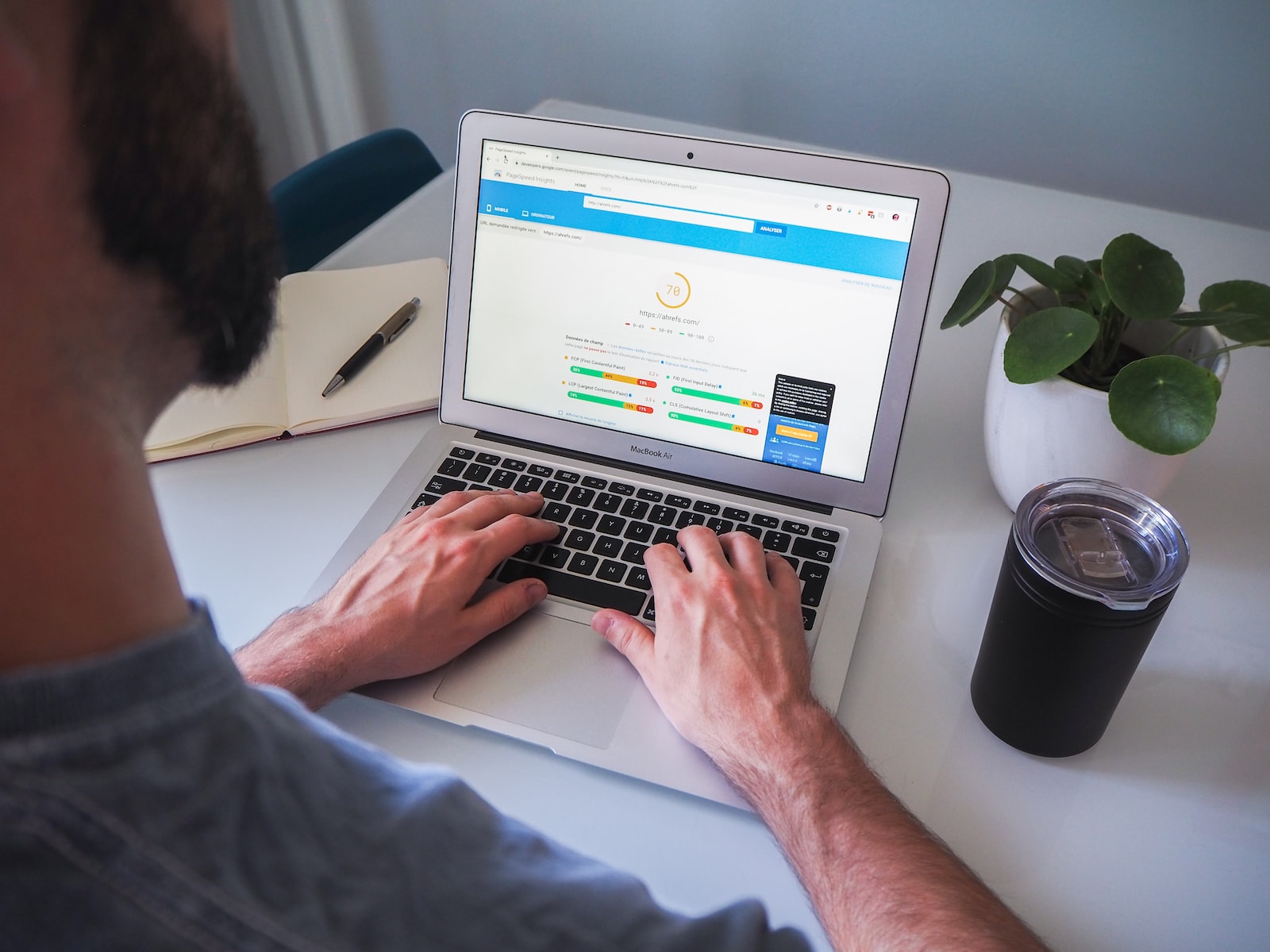
person using macbook pro on white table

If you own a website, you know that speed is everything. It’s the difference between attracting more visitors and driving them away, being able to convert those visitors into customers, and having an SEO-friendly site that ranks high in search results. Luckily, there are plenty of ways to improve your site’s performance and make sure it loads quickly. In this article, we’ll take a look at three of the easiest ways to make your website faster:  1. Reduce the size of your images The number one thing you can do to make your website faster is to reduce the size of your images. This will help keep things snappy for users and help with load times. The larger the file size, the longer it takes for all those bits of data to download and display on your screen. So how do you reduce image size? You can start by making sure that all of your images are optimized for web viewing. This means that they should be at least 72 dpi (dots per inch) and no more than 1024×768 pixels in size. It also means that they should be JPEGs rather than GIFs or PNGs, since these types allow files to compress more efficiently than other formats do. To check how much an image weighs, right-click on it and select “Properties.” You’ll see a file size there. If it’s too large, try resizing it in an image editor like Photoshop or Paint. You can also use an online tool like TinyPNG to compress it down even further. 2. Use a Content Delivery System (CDN) A content delivery network (CDN) such as Cloudflare, is a system that stores copies of your website’s files on servers in different locations around the world so that users can access them from closer to their location. A CDN will typically reduce the time it takes for pages to load by 50% or more. A CDN is a crucial tool for any website with a global audience. It reduces latency and improves the user experience by improving page load times and reducing bandwidth consumption. 3. Cache your data with caching plugin Caching plugin uses a cache system to store a copy of your site’s static resources in memory so they don’t have to be reloaded every time they’re accessed (they’ll be served from memory instead). Caching plugins go through all of your website code and remove any information that isn’t necessary for displaying the content. This means that when someone visits your site, they won’t have to wait for all of those extra bits of information before seeing what’s important—they’ll just see the text and images right away!  The internet is a fast-moving place. If you want to stay competitive, your website must be fast, too. Hopefully, these 3 ways to make your website faster will help your website perform better as well. Additional Resources:

A Website Helps Businesses Thrive. Here’s Why.

A website helps Businesses Thrive. Here’s why.

How can a website helps business thrive? Let’s face it, we’re living in a digital world where possibilities are limitless. People of all ages, in all walks of life, have a use for a computer or a mobile phone one way or another. So, why is having a website crucial to your business? Before we answer that, let me ask you something first. Whenever you are curious about something, where do you go first? For example, a place you wish to visit, a recipe you wanted to try, or a celebrity you are crushing on after watching a movie. That’s right, it’s Google! The Internet. Let me give a situational example. There is a potential customer, let’s call him Mr. Smith, who is scrolling on his phone. He suddenly remembered that today is his wedding anniversary with his wife and he needs to think of a last-minute surprise. Mr. Smith then decided to look for a fancy restaurant online, where he can book a table for two for tonight’s dinner to celebrate. Now, your business is a fancy restaurant but you don’t have a website where your customers can scroll through information about your business. While your biggest competitor on the other hand has a Website with all important functions such as; SEO-Ready, means customers can look up “fancy restaurants near me” on google and your website will be the first thing they’ll see. This means optimizing your Websites functionality and using just the right keywords to help your customers find you. A gallery of images that shows the best parts and features of your fancy restaurant. People today love visiting restaurants that are Instagram picture-worthy. Build-in booking features. Customers can easily book a table anytime, anywhere. A map feature that will show customers exactly where your business is located. A homepage banner where you can showcase any promos you have for the day. A messaging system where customers can reach out and talk to a staff member instantly for assistance. In the About Us section where you can show all the information about your company. This is a chance to let visitors get to know your business on a personal level. And everything else in between.  Given this scenario, where do you think Mr. Smith will have his dinner tonight? Of course, with no hesitation, he will be going to your competitor. Why? Because all his questions were answered just by visiting their Website. With just a few clicks and scrolls, he’s immediately convinced that it is the perfect place where they can spend a lovely time for their anniversary. Now if you finally decided that you would like to explore more about owning a website, I’d like to give you a little tip. There are plenty of agencies that offer Web Design and management services. In searching for the right agency for your business, it’s important to keep in mind and to make sure that you are getting your “value for money.” If you’re living in a first-world country like the USA, the United Kingdom, Canada, Australia, and so on, the best way to get “value” for your money is to find agencies from another country.  Why you might ask? It’s simple, it’s cheaper! Same quality but less expensive.  And if you would like to dive deeper into why you should choose Filipino Web Designer, read all about it here: Why choose a Filipino Web Designer? It’s also helpful if you did your research beforehand. Here are more tips that you might need in making the most of Web Design Services: “4 Simple Web Design Tips” What are the takeaways? If you want your business to thrive in today’s marketing generation, you got to have your Website! Having a website dedicated to your business is not a necessity but now a need.

Grow Your Business Using These 4 Simple Web Design Tips

man using Apple computer - web design tips

Did you know that nearly 75% of consumers judge a company’s credibility based on its website design? This fact highlights the importance of having a well-designed website to help grow your business. Every business owner starts from scratch and has a learning curve when it comes to online marketing. Your website is often the first point of contact with potential customers. Therefore, it must encourage visitors to take action, whether that’s making a purchase or reaching out for more information. By focusing on a few simple web design tips, you can significantly enhance your online presence and grow for your business. 1. User-Friendly is Google-Friendly When it comes to web design, simplicity is key. A user-friendly website is not only easier for your visitors to navigate, but it also signals to Google that your site is valuable. If users can quickly find what they’re looking for, they’re likely to spend more time on your site. This engagement is essential as Google rewards websites with higher rankings in search results. Create Intuitive Navigation Ensure that your website has a clear menu and easy-to-find links. This allows visitors to quickly access important pages, whether it’s your products, services, or contact information. A well-structured website will not only improve user experience but also increase your chances of converting visitors into customers. 2. Pick the Expert: Low Cost but Quality Finding the right web design expert can be a game-changer for your business. While it may be tempting to go for the cheapest option, remember that quality matters. A poorly designed website can result in lost sales, as visitors may leave in frustration if they can’t find what they need. Research and Compare Look for designers who have experience in creating user-friendly websites. Check their portfolios and client reviews to ensure they can deliver the quality you need. Sometimes, investing a little more upfront can lead to significant savings in the long run by preventing lost sales. 3. Easy to Use The ease of use of your website plays a crucial role in retaining visitors. When people arrive at your site, they should be able to find the information they need without digging through multiple pages. Highlight Key Information Place important content, such as contact details, product information, and testimonials, prominently on your homepage. Use headings, bullet points, and images to break up text and make it easier to digest. Remember, the goal is to encourage users to scroll and discover more about what you offer. 4. Mobile Matters In an era where mobile browsing is on the rise, having a mobile-friendly website is essential. Believe it or not, websites with engaging visuals and high-quality content can greatly influence buyers’ decisions. Optimize for Mobile Users Your website should look and function well on all devices, including smartphones and tablets. A responsive design adjusts to different screen sizes, ensuring a seamless experience for every visitor. Not only does this enhance user satisfaction, but it also boosts your SEO rankings, as Google prioritizes mobile-friendly sites. Conclusion To grow your business online, implementing simple web design tips can make a significant difference. Remember that a user-friendly website is crucial for engaging visitors and converting them into customers. By choosing quality design, ensuring ease of use, and optimizing for mobile, you’ll set yourself up for success in the competitive digital landscape. Ready to revamp your website and grow your business? Start by implementing these web design tips today! For more expert advice on web design and digital marketing, check out resources from the American Marketing Association and Neil Patel. In summary, focusing on user-friendly design, selecting the right experts, providing easy access to information, and optimizing for mobile users are key strategies for creating an effective website. Embrace these tips, and watch your business thrive in the digital world!