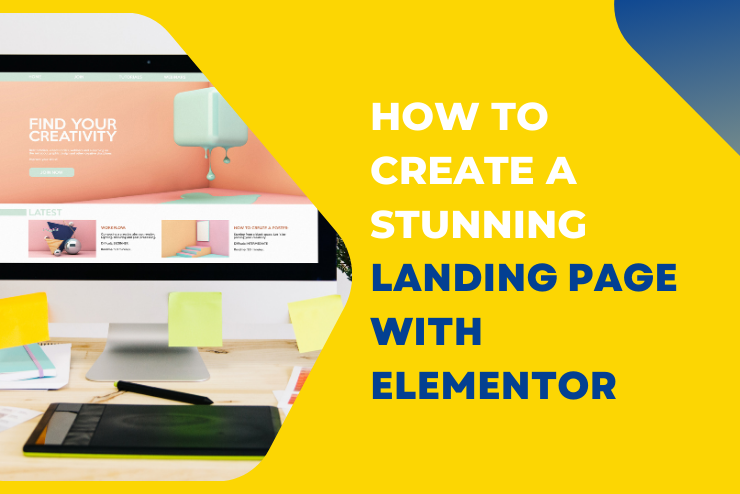
Creating a landing page that grabs attention and converts visitors into customers is crucial for any business.
Elementor, a powerful page builder for WordPress, makes this task easy and fun. In this blog post, I’ll guide you through the steps to create a stunning landing page with Elementor.
Let’s get started!

Why Use Elementor?
Elementor is a popular choice for many web designers because of its ease of use and flexibility. Here are a few reasons why you should consider using Elementor:
- Drag and Drop Builder: No coding skills are required. Just drag and drop the elements you want to use.
- Pre-designed Templates: Access a library of beautiful templates that you can customize to fit your brand.
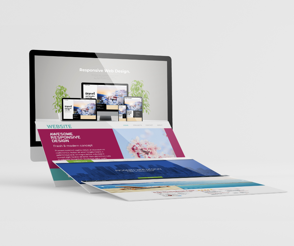
- Responsive Design: Ensure your landing page looks great on all devices, from desktops to mobile phones.
Step-by-Step Guide to Creating a Stunning Landing Page
1. Install and Activate Elementor
First, you need to install and activate the Elementor plugin on your WordPress site. Follow these steps:
- Go to your WordPress dashboard.
- Click on “Plugins” > “Add New.”
- Search for “Elementor.”
- Click “Install Now” and then “Activate.”
2. Choose a Template or Start from Scratch
Elementor offers a variety of templates that you can use as a starting point. Here’s how to choose a template:
- In your WordPress dashboard, go to “Pages” > “Add New.”
- Click “Edit with Elementor.”
- Click on the folder icon to open the template library.
- Browse the templates and select one that fits your needs.
- Click “Insert.”
If you prefer to start from scratch, you can do that too. Just skip the template step and start building your page from a blank canvas.
3. Customize Your Header
Your header is the first thing visitors will see, so make it eye-catching. Here’s how:
- Drag and drop a “Heading” widget to the top of your page.
- Enter your headline text. Make it bold and clear.
- Use the styling options to adjust the font, size, and color.
Pro Tip: Use a strong, action-oriented headline that tells visitors exactly what they can expect from your page.
4. Add Images and Videos
Visuals are crucial for making your landing page attractive. Add images and videos to engage your visitors:
- Drag and drop an “Image” widget where you want the image to appear.
- Click “Choose Image” to upload or select an image from your media library.
- Use the styling options to adjust the size and alignment.
For videos, drag and drop the “Video” widget, then add the URL of your video.
5. Include a Clear Call to Action (CTA)
A landing page without a clear call to action won’t convert well. Here’s how to add a CTA:
- Drag and drop a “Button” widget to your page.
- Enter your CTA text (e.g., “Sign Up Now,” “Get Started,” “Learn More”).
- Link the button to the desired action (e.g., a signup form, product page, contact form).
- Use the styling options to make the button stand out.
Pro Tip: Use contrasting colors for your CTA button to make it pop.
6. Add Trust Elements
Building trust with your visitors is essential. Add testimonials, reviews, or logos of companies you’ve worked with:
- Drag and drop a “Testimonials” widget to your page.
- Enter the testimonial text and the name of the person giving the testimonial.
- Add images if available.
For logos, use the “Image” widget to add logos of your clients or partners.
7. Optimize for Mobile
Many visitors will view your landing page on mobile devices. Ensure your page looks great on all screen sizes:
- Click the “Responsive Mode” icon at the bottom of the Elementor panel.
- Switch between desktop, tablet, and mobile views.
- Make adjustments as needed to ensure everything looks good.

8. Preview and Publish
Before publishing your landing page, preview it to make sure everything looks perfect:
- Click the “Eye” icon at the bottom of the Elementor panel to preview your page.
- Make any final adjustments.
- Click “Publish” when you’re satisfied with the result.
Tips for a High-Converting Landing Page
- Keep It Simple – Avoid clutter. A clean, simple design helps visitors focus on your message.
- Use High-Quality Images – Poor-quality images can make your page look unprofessional.
- Focus on Benefits – Highlight the benefits of your product or service, not just the features.
- A/B Test – Test different headlines, images, and CTAs to see what works best.
Final Thoughts
Creating a stunning landing page with Elementor is straightforward and fun. By following these steps and tips, you can design a page that not only looks great but also converts visitors into customers.
Ready to create your own stunning landing page? Get started with Elementor today.
—
For more detailed information on landing page best practices, check out these authoritative resources:
– Neil Patel on Landing Page Design
– HubSpot’s Guide to Landing Pages
– Moz’s Landing Page Optimization Tips
—
If you found this guide helpful, please share it with others who might benefit from it. And don’t forget to subscribe to our newsletter for more tips and tutorials on web design and digital marketing. Happy designing!

